
Social media platform Bluesky has integrated customizable display settings, including a dedicated dark mode, to enhance user experience and compete with established rivals in the microblogging space. As the platform continues to scale its user base following its transition from an invite-only model to a public-facing service, developers have prioritized interface features that align with modern accessibility standards. The implementation of dark mode serves as a critical component of this strategy, offering users a way to mitigate eye strain and optimize mobile device battery performance during extended browsing sessions.
The push toward feature parity with platforms like X (formerly Twitter) and Meta’s Threads has seen Bluesky rapidly deploy a suite of tools, ranging from advanced moderation filters to the recently added drafts functionality. However, the ability to modify the visual theme remains one of the most requested and utilized features among the growing community of "skeeters," as the platform’s users are colloquially known. By providing a darker color palette, Bluesky acknowledges the shifting preferences of a digital audience that increasingly favors low-light interfaces for nighttime use and professional environments.
Navigating the Interface to Activate Bluesky’s Dark Mode
Activating the dark mode feature on Bluesky involves a straightforward process that is consistent across its various iterations, though the navigational path differs slightly between the mobile application and the desktop web interface. For users accessing the service via a desktop browser, the transition begins with the primary navigation sidebar located on the left side of the screen. Users must locate and click the "Settings" tab, which serves as the hub for all account and interface modifications.
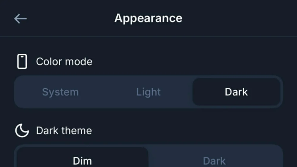
Within the Settings menu, a sub-section titled "Appearance" contains the necessary toggles for visual customization. Upon selecting Appearance, users are presented with a choice between three primary themes: Light, Dark, and System. Selecting the "Dark" option immediately transforms the interface from a high-contrast white background to a more subdued, darker aesthetic. This change is instantaneous and does not require a page refresh or application restart, reflecting the platform’s responsive design architecture.
On mobile devices, including iOS and Android platforms, the process is initiated by tapping the three-line "hamburger" icon or the user’s profile avatar in the top-left corner of the screen. This action reveals the side navigation drawer, where the "Settings" gear icon is located. Similar to the desktop version, the user then navigates to the "Appearance" menu to find the dark mode options. The mobile interface is designed for thumb-driven navigation, ensuring that these settings are accessible within a few taps.
Distinguishing Between Dim and Dark Display Options
A notable aspect of Bluesky’s dark mode is the inclusion of two distinct variations of the darker theme, categorized as "Dim" and "Dark." This secondary level of customization allows users to fine-tune their visual experience based on personal preference or hardware specifications. The "Dim" setting typically utilizes a deep navy blue or dark gray background, which maintains a level of contrast that some users find more legible than pure black. This option is often preferred by those who find the transition from white to black too jarring for their visual perception.
The "Dark" setting, conversely, often utilizes a true black background, which is particularly beneficial for users with devices featuring Organic Light Emitting Diode (OLED) screens. On OLED displays, black pixels are essentially turned off, which results in significant power savings and deeper contrast ratios. By offering both "Dim" and "Dark," Bluesky provides a level of granular control that surpasses the basic on-off toggles found on many legacy social media platforms.
Furthermore, the "System" setting provides a seamless integration with the user’s operating system preferences. When this option is selected, the Bluesky application will automatically mirror the theme set at the device level. If a user has their iPhone or Android device scheduled to switch to dark mode at sunset, Bluesky will transition simultaneously. This automation ensures a consistent user experience across all applications and reduces the need for manual adjustments as lighting conditions change throughout the day.
The Competitive Context of Bluesky’s Dark Mode Development
The refinement of Bluesky’s dark mode comes at a time of significant volatility in the social media landscape. As users migrate away from X due to changes in leadership and platform policy, Bluesky has emerged as a primary destination for those seeking a decentralized alternative. In this competitive environment, the "feel" of an application is as important as its functionality. Ensuring that the interface is modern, sleek, and customizable is a key factor in retaining users who are accustomed to the polished environments of established tech giants.
Market analysts note that Bluesky’s growth strategy has been heavily reliant on recreating the familiar "Twitter-like" experience while introducing the benefits of the AT Protocol (Authenticated Transfer Protocol). The protocol allows for a federated social network where users can move their data between different servers. While the underlying technology is revolutionary, the front-end experience—including the implementation of dark mode—must remain intuitive to attract a mainstream audience. The ability to easily toggle these settings is a testament to the platform’s focus on user-centric design.
Comparatively, Meta’s Threads also offers a dark mode, but its implementation has occasionally been criticized for a lack of secondary "dim" options. By offering more choices in its appearance settings, Bluesky positions itself as a more flexible and user-responsive platform. This attention to detail is part of a broader effort to build a "pro-user" reputation, contrasting with the often top-down and rigid interface changes seen on other major networks.

Technical and Physiological Benefits of Darker Interfaces
Beyond the aesthetic appeal, the decision to turn on Bluesky’s dark mode is often rooted in physiological and technical considerations. Digital eye strain, also known as Computer Vision Syndrome, is a growing concern for heavy social media users. High-intensity blue light emitted by screens can lead to headaches, blurred vision, and disrupted sleep patterns. Darker themes reduce the overall luminance of the screen, which can alleviate some of these symptoms, particularly in low-light environments.
From a technical standpoint, the energy efficiency of dark mode cannot be overstated for mobile users. As social media apps are notoriously resource-intensive, any feature that can extend battery life is a significant advantage. For the millions of users currently utilizing smartphones with OLED or AMOLED technology, the "Dark" or "Midnight" themes are a practical tool for maximizing device uptime. This utility is especially relevant for a platform like Bluesky, which encourages real-time interaction and frequent feed-scrolling.
The psychological impact of UI color schemes is also a factor in user retention. Darker interfaces are often perceived as more professional, modern, and less "cluttered." This perception can influence how users engage with content, potentially leading to longer session durations. By providing a comfortable environment for content consumption, Bluesky enhances its viability as a primary source for news and social interaction.
The Evolution of Customization on the AT Protocol
As Bluesky continues to evolve, the appearance settings are expected to expand further. The decentralized nature of the AT Protocol suggests a future where users might have even more control over their interface, potentially including custom themes, font adjustments, and modular layouts. The current implementation of dark mode is likely just the foundation for a more robust personalization suite.
Developers within the Bluesky ecosystem have hinted at the possibility of user-generated "skins" or themes, which would allow the community to design their own visual experiences. This would align with the platform’s ethos of decentralization and user empowerment. For now, however, the focus remains on perfecting the core experience. The reliability and ease of use found in the current dark mode settings are essential for a platform that is still in a high-growth phase.
The recent addition of features like video support and improved search algorithms has been accompanied by subtle tweaks to the dark mode’s color palette to ensure that media content remains vibrant against the darker backgrounds. This iterative approach to design ensures that new features do not compromise the visual integrity of the platform.
Public Reaction and the Shift in Social Media Habits
The response from the Bluesky community regarding the platform’s visual options has been overwhelmingly positive. On the platform itself, users frequently share "screenshots" of their customized feeds, highlighting how the dark mode enhances the visibility of high-quality photography and art. The creative community, in particular, has praised the "Dark" setting for providing a neutral canvas that allows visual content to stand out without the distraction of a bright white border.
This shift in user habits—where the interface is as much a part of the conversation as the content—marks a new era in social media. Users are no longer content with "one-size-fits-all" platforms; they demand tools that adapt to their lifestyle and physical needs. Bluesky’s commitment to providing these tools, starting with a robust dark mode, has been instrumental in its rise as a serious contender in the microblogging space.
As the digital landscape continues to fragment, the platforms that succeed will be those that prioritize user comfort and agency. The simplicity of the process to turn on Bluesky’s dark mode reflects a broader philosophy of removing barriers between the user and their digital experience. Whether for health reasons, battery preservation, or simple aesthetic preference, the dark mode feature remains a cornerstone of the Bluesky user interface.
Conclusion and Future Outlook for Bluesky’s UI
The ability to switch to a darker color scheme is more than a mere cosmetic update; it is a reflection of Bluesky’s maturity as a social media platform. By providing clear, accessible paths to activate dark mode and offering variations like "Dim" and "Dark," the platform caters to a diverse global audience with varying needs. As Bluesky moves forward, the integration of these user-focused features will likely continue to be a primary driver of its adoption.
For users who have not yet explored these settings, the transition is a simple matter of navigating to the appearance menu. The immediate relief from screen glare and the sleek, modern look of the dark interface provide a compelling reason to make the switch. As the "fediverse" grows and decentralized protocols become more mainstream, the standards for user interface design will continue to rise, with Bluesky currently leading the charge in accessible and customizable social networking.
